
 Deutsch
 English
 Türkçe
Overview Section
- This section contains basic and summary information about your sales.
- Filter

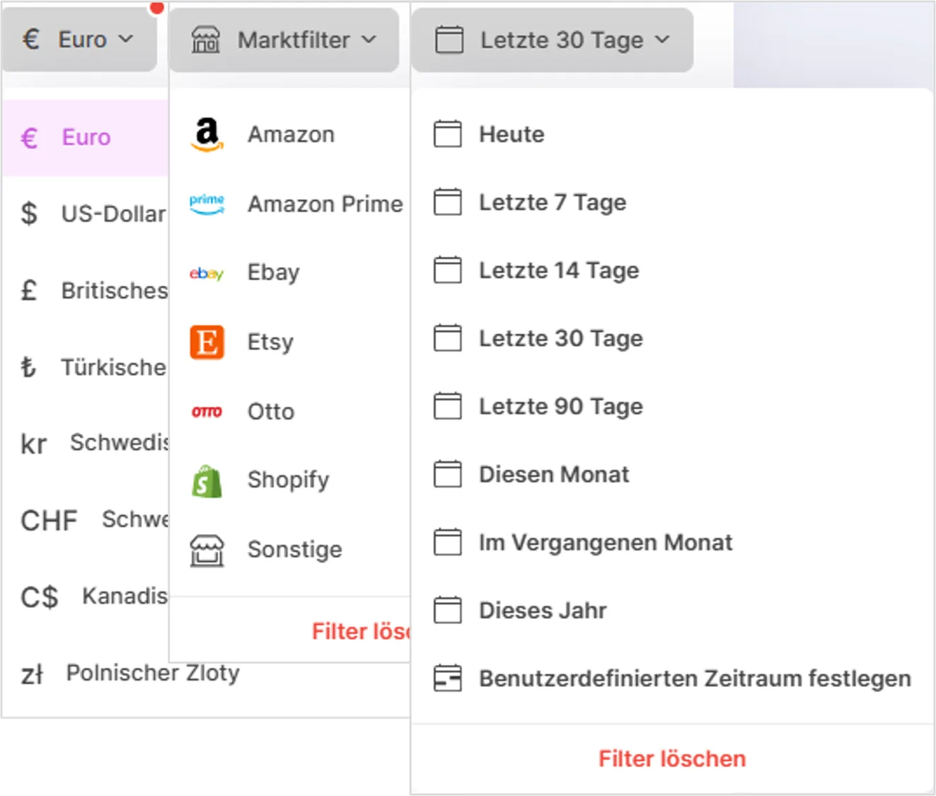
- Currency Filter: Shows the application's currency setting. Clicking here lets you choose between different currencies.
- Market Filter: Lets you filter data based on a specific market or sales channel. You can use this filter, for example, if you only want to see sales from a particular e-commerce platform.
- Time Filter: Lets you select the time period for the displayed data. Clicking here lets you choose from various options such as "Today", "Yesterday", "This Week", "Last Month", or "Custom Date Range".

- You can instantly see the number of orders, total revenue, and unpaid invoices in colored panels.
Visualization of Sales Data
- Charts are used to analyze your sales.
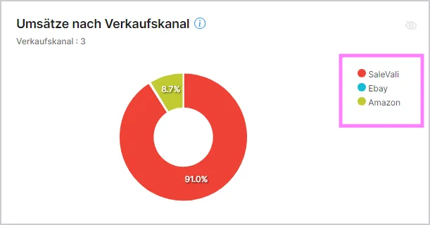
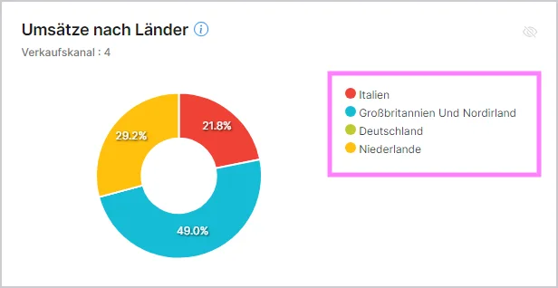
- Two different pie charts show the distribution by sales channel and country.
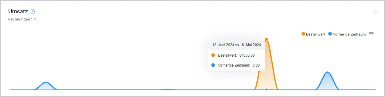
There is a chart where you can compare your revenue for the selected period with that of the previous year.
Product and Customer List
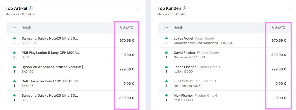
- A list of the 10 top-selling products by revenue is displayed. This helps you understand which products are crucial to your revenue.
- The buyer list shows who has made the most purchases or placed the most orders.
Period Comparison and KPI Cards
- SaleVali lets you compare your performance across preset periods: Today, Yesterday, This Month, and Last Month. For each period, the dashboard shows sales revenue, order count, and unit count, along with the percentage change against the previous equivalent period (for example, this month versus last month, or today versus yesterday). This gives you a quick read on whether your business is trending up or down without having to do the math yourself.
- The colored KPI cards at the top of the dashboard are clickable. Selecting a card takes you straight into the corresponding filtered list: for instance, clicking the orders card opens your Orders list already filtered to match the selected period, and clicking the open invoices card jumps into a filtered Invoices list. This makes it fast to go from a summary number to the underlying records behind it.
Rank Changes and Widget Visibility
- The Top Products and Top Customers lists now show a small arrow next to each entry indicating whether its rank has moved up or down compared to the previous period. An upward arrow means a product or customer climbed the ranking since the last period, while a downward arrow means it slipped, giving you a quick way to spot rising bestsellers or customers whose activity is cooling off.
- Every widget on the dashboard has an eye icon that lets you show or hide it. Use this toggle to declutter the dashboard and keep only the widgets relevant to you visible, without losing access to the hidden ones, which can be turned back on the same way at any time.
Video Tutorials
SaleVali Dashboard
Video in German
Overview of Top Customers and Top Products
Video in German
Viewing Reports with Comparison Data from Previous Months
Video in German
Viewing Sales Reports by Marketplace/Country
Video in German
Was this article helpful?
Thanks for your feedback!